Hi Folks,
Well – as promised here is the 2nd part of my blog on designing a Tableau viz for the mobile SuperStore Sales exec. For Part 1 – click here.
Part 1 took you through the design considerations of the Sales Performance Summary dashboard like this one showing 8 x key numbers colour coded by performance, which was crafted to fit perfectly on an apple watch, and actually looks pretty good on any smartphone.
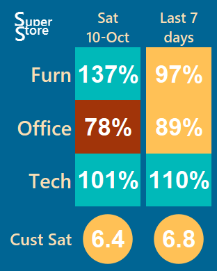
So, imagine for a moment you are the informed Sales Exec looking at these numbers in your daily email subscription, you might think something like “Office Sales weren’t so good this last week, and pretty bad yesterday. Is this a worsening trend that I need to do something about?”
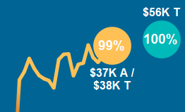
Imagine now that you smile as you take a quick swipe down the screen, where you know the info you are looking for is right there in a trending chart or ‘sparkline’ like this one:
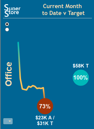
You instantly see that you are $8K behind sales target so far this month, and it is mostly due to that bad day yesterday. Hey – but there’s still time to get to that $58K target by month end – the monthly sales bonus might just be salvageable.
Next you pull out your smartphone, find the email, click on the image – and a few moments later you are interacting with your viz, checking out the actual sales for yesterday, examining lasts month trend, or looking into which region(s) are having the problem. Pretty cool hey!
So, putting this relatively simple viz together for my ‘Superstore Exec’ was harder than it looks. Getting the balance right between a design for a static 312 pixel wide email image, and an interactive mobile experience presented some challenges.
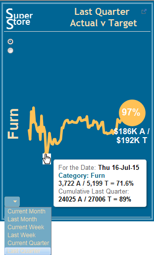
A ‘spark’ line chart with a Circle at end is a fairly simple dual axis solution, but adding that second circle for 100% month end was a bit tricky, especially as you want it to disappear when you are looking back at say the last quarter.
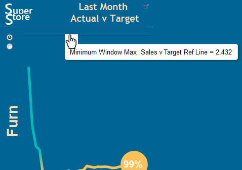
Also, a timeline without a zero on the vertical axis can give a misleading indication of variability. Say, when the minimum value for the month is 95% and the max value is 105%, Tableau by default takes up the whole view – making a few % variation like like a roller coaster!. Fixing the axis is sometimes a good solution, but I find a much better way to do it is via dynamic invisible reference lines.
But the trickiest thing to get right was the labels. You really want the Actual and Target values to be there for the email, but they take up a fair bit of space; it’s really hard to keep that % label in the middle of the circle; and towards the end of the month the labels can really start overlapping each other. Leaving the labels on automatic just didn’t cut it, I had to develop some logic to tell Tableau whether to put the labels above or below the dot. And at the month end 100% Target, you really don’t want an A label out there all by itself without a number next to it.
To learn how I overcame all these challenges, check-out a recorded youtube video demo of how I built this viz – you’ll be glad you did….
For a downloadable tableau public version of this workbook – check out my Tableau Public site.
Enjoy responsibly – and hope to see some of you in Vegas……
cheers
Craig Dewar


Great follow up Craig – it’s a lot harder than it looks designing so small! Do you mind if I demo this example during the watch part of my presentation and give you a name check?
no problems – more than happy!
Hey Craig. Great posts and interesting idea to fit data in such a small space. One question… did you find a way to push the image to the watch? I don’t think the mail app supports images in email messages.
Alan,
The images in the Tableau subscription email work a treat. In Paul Chapman’s demo during #data15 he had a live version projected up on the big screen with a special camera. Way cool!
Feel free to download my TP version, and set up a subscription on your own server if you want to see it for yourself.
cheers
Craig