Hi Folks,
It has been a while between blogs.
Happy to say that I’ve been inspired to get back on the muse by a colleague that I met virtually back in August. Robert Crocker was also one of the presenters at the recent Tableau Fringe Festival APAC 2017. Robert did a nice piece on Doodling, and I did some tectonic shapefile tricks. Just recently we found ourselves meeting up for real at a Makeover Monday group hosted by @vizchic, where we undertook that weeks challenge to remake an existing vizualisation of Stolen bikes in the UK.
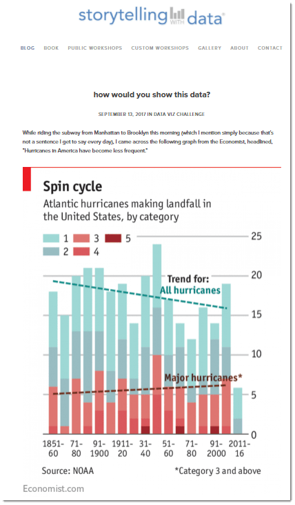
Well, later that week, in between some mountain biking, and some travellers tales, Robert let me in on another viz makeover that he had on the go. This challenge was created by Cole from Storytelling With Data. The challenge was to makeover an Economist chart titled Spin cycle which accompanied an article: Hurricanes in America have become less frequent.
Along the way, I got the opportunity to collaborate with Rob in a data discovery session; chip in a few viz ideas, and proofread his draft blog. You can check out his blog posts at: https://vizsimply.com/blog/
So, thanks to having a great head start using Roberts cleaned-up tableau file template, I was able to get straight in and spend about an hour or so adding my own take in a redo of the original design.
The original design was primarily a stacked bar chart (coloured by Cat) over time, binned by decade. This design made it quite difficult for the eye to really see the change over time of the major hurricanes. In fact, without the major hurricanes trendline, the average viewer would not be able to pick whether the trend was up or down. The partial decade with a low count actually made the viz quite misleading – especially if it was included in the trend line calculation.
As I already had a good idea what was in the data set, I jumped straight into experimenting with a few alternate viz types. I had a look at wind speeds and Barometric pressure data vs Category. I also played with some differing timelines. I eventually honed in on a layout of each individual hurricanes as circles on a continuous timeline. 150 years of hurricanes on a single timeline is quite crowded. To spread spread them out so they weren’t all overlapping I first added Category to the rows, and then secondly added some ‘jitter’ as a Y axis.
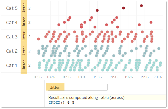
I wanted to emphasize the severe hurricanes, so sized the circles by maximum windspeed.
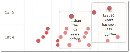
It quickly became apparent that if you grouped the top 2 categories instead of the top 3 categories you could clearly see a significant difference in last 5 decades up to 2016, compared with 5 decades prior (i.e between 1916-1961). So to help guide my consumers eyes towards the same conclusion, I added some area annotations with borders grouping the last 50 years, and comparing to the 50 years prior.
Initially the area annotation text was added within the view as a part of the enclosing border. However, reviewer feedback showed that viewers of the viz were reading the annotations left to right, not top to bottom, and missing the flow of my insight.
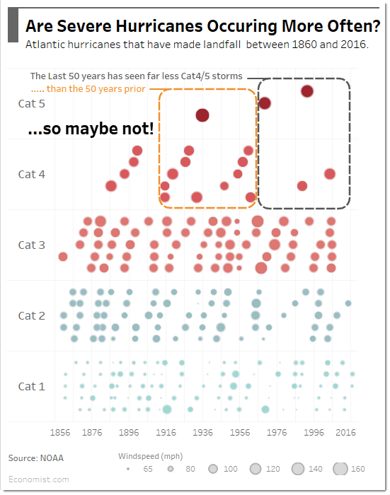
I then added floating text objects to the dashboard layer to ensure that the viewer was directed first to the last 50 yrs, and then to the 50yrs prior even though that meant going against their english speaking instincts.
The final product worked out ok – and turned out like this:
The interactive version is published on Tableau Public as:
https://public.tableau.com/views/HurricaneHistoryMakeover/CraigsTake


